
When it comes to spending time in our kitchens, whether you’re an avid baker or someone who sticks to microwave meals, practicality is key. But kitchens are not just functional spaces; they often serve as gathering places for family and friends.
Therefore, choosing the right paint color for your kitchen walls is crucial in creating a warm and welcoming atmosphere that reflects your personality. So, what are the best paint colors for kitchen walls?
To achieve a fresh and trendy look, draw inspiration from nature. Sky blues, spring greens, sage greens, and creams are popular choices for cooler and lighter shades. If you prefer warmer hues, consider buttery yellow or pinky terracotta. For a more dramatic and cozy feel, shades like navy, moss green, and chocolate brown can transform your kitchen into a sanctuary.
Since a complete kitchen renovation occurs only about once a decade in my house, I like to keep the space inviting and up-to-date by simply changing the wall color. It’s incredible how a fresh coat of paint can instantly update tired walls and set the mood for the entire room.
Now, let’s explore the trending paint choices for kitchens and discover the latest kitchen paint color options.
8 Best Colors To Paint Kitchen Walls
Sky Blue
Blue, being the most significant color trend for 2024, continues to be inspired by the natural world. It infuses tranquility into our homes, reminiscent of a summer sky or a peaceful forest lake.
When it comes to kitchen colors, sky blue is an ideal choice. It not only portrays a sense of calm but also brings freshness reminiscent of a spring morning. This makes it perfect for a practical and busy space where your day begins and ends.
Sky blue is a versatile color that works well in various kitchen styles, including English and French country-style, cottage-core, or vintage kitchens. You can pair it with white or gray cabinetry for an airy and light-filled room. For those seeking drama, navy blue or charcoal features can be combined with sky blue.
Notably, sky blue is suitable for a family kitchen, providing comfort and energy for kids going off to school. It also creates a serene spa-like atmosphere for serious cooks who prioritize a composed mindset when tackling complex recipes.
If you are considering using sky blue paint in your kitchen, you may want to explore the following stunning colors of the year:
- Thermal by C2 Paint
- Bluebird by Krylon
- Upward by Sherwin-Williams
- Renew Blue by Valspar.
Incorporating sky blue into your kitchen design will undoubtedly bring a touch of serenity, clarity, and contentment.
Dark Blue
Dark and moody shades are becoming increasingly popular in kitchen interiors, replacing the traditional notion that painting a small room white is the best choice. This trend creates a cozy sanctuary in the kitchen, with darker shades like navy, indigo, and midnight blue imparting a dramatic and contemporary effect. For a truly immersive experience, consider applying a single inky shade to the entire room.
Alternatively, you can create contrast by keeping the walls moody and opting for cabinetry in bold and contrasting colors. Consider bright navy and white for a vibrant look or go retro with a bottle green or orange.
Here are a few options for bold kitchen colors:
- Hale Navy by Benjamin Moore: A deep and rich navy shade.
- Deep Dive by Clare: A striking and captivating deep blue.
- Hague Blue by Farrow & Ball: A timeless and elegant deep blue.
- Abyss by Ressource: A luxurious and intense shade reminiscent of the deep sea.
By embracing these bold color choices, you can transform your kitchen into a stylish and visually impactful space.
Moss Green
Green is an indispensable inclusion in any list of natural shades. This year’s paint colors embrace the abundant hues of leaves, stems, and flowers. Moreover, kitchens are blooming with the infusion of trendy green tones.
If you have concerns that green might lend a juvenile appearance to your kitchen, put those worries aside. This season’s colors exude a sense of sophistication and offer more subdued variations. Think of mossy and moody greens reminiscent of ivy or French garden furniture.
Like blue, green possesses a calming aura and is associated with positive attributes such as growth, health, and wellness. It serves as the perfect backdrop for any interior design, seamlessly blending with charming vintage, minimalist, or traditional aesthetics.
Moss green can even be treated as a neutral shade, complementing it with white, natural wood, or striking marble slabs.
To add a dash of modernity to your kitchen walls, consider selecting one of the designated colors of the year for 2024:
- Ironside by Dutch Boy
- Virdis by Graham & Brown
If you prefer the timeless classics, the following options may suit your taste:
- Forest Green by Benjamin Moore
- Oakmoss by Sherwin-Williams
Spring Green
The kitchen offers an excellent opportunity to experiment with vibrant colors. Enhance the overall ambiance by painting the walls a refreshing shade of green. Opt for a fruity hue instead of overwhelming neon or chartreuse options.
For a Scandi kitchen, consider pairing leafy green shades, such as apple or celery, with white and blue accents. In a more traditional kitchen, these shades can exude a sleek and sophisticated aura when combined with warm wood and brass accessories.
Here are a few delectable shades of green that you might find appealing:
- Pretty Ugly by Backdrop: This shade offers a unique blend of beauty and attractiveness.
- Royal Orchard by Behr: A regal and inviting option that brings a touch of elegance.
- Avocado Toast by Clare: This hue encompasses a sense of warmth and comfort.
- Gleeful by Sherwin-Williams: A joyful shade that will surely elevate the kitchen’s atmosphere.
Sage
Sage is an incredibly soothing color choice for a kitchen, lighter than moss and slightly more subdued than spring green. This understated shade effortlessly combines vintage charm with the current eco-chic trend.
Personally, I adore how sage pairs with the natural textures of wood, wicker, and pots of herbs. Additionally, it offers a whimsical charm when contrasted against bolder shades like cobalt, teal, or terracotta against the muted walls.
Considering the wide range of sage shades available, I have carefully selected a few options for you:
- Dirty Martini by Clare: A delightful shade reminiscent of nature’s finest hues.
- Floating Lily Pad by Dunn Edwards: A gentle green tone that creates a serene ambiance in any kitchen.
- Green Smoke by Farrow & Ball: An elegant and classic sage shade that exudes sophistication.
- Evergreen Fog by Sherwin-Williams: This ethereal green hue adds a sense of tranquility to your kitchen space.
Terracotta
When it comes to natural colors for your kitchen, it’s not always about the bright and vibrant options. Consider wrapping your kitchen in rich shades inspired by clay, soil, and stone, also known as earthy colors.
One excellent option is terracotta, which has become a popular alternative to the traditional fire-engine red. This paint color offers a unique blend of energy from red and the softness of brown, creating a warm and inviting atmosphere ideal for family kitchens.
Terracotta is commonly used for tiles and is particularly well-suited for Mediterranean and South-West interior styles, as well as rustic and country looks. You have a variety of paint colors to choose from, ranging from shades with a pinkish undertone to burnt shades with hints of brown.
By drenching your kitchen walls in this lush terracotta shade, you can create an eco-inspired or Boho look. Enhance the overall aesthetic by adding natural wooden accents, brick elements, baked tile, and other colors found in nature’s palette.
To help you get started, here are some of my favorite terracotta shades:
- Wild Flower by Benjamin Moore
- Tuscan Terracotta by Dulux
- Persimmon by Sherwin-Williams (Color of the Year for 2024)
- Lush Peach by Valspar
Make the most of these stunning terracotta hues and transform your kitchen into a captivating space that oozes warmth and natural beauty.
Brown
Brown is a versatile and rich color that can bring a warm and cozy feel to any space. It has long been a staple in winter wardrobes and can have the same impact when used in interior design. When paired with other neutrals such as black and white, brown creates a striking and modern contrast.
In minimalist or Japandi-style interiors, vibrant brown walls can serve as an anchor, adding depth and visual interest. To avoid a cave-like atmosphere, it’s advisable to keep the ceiling and floor light in color.
If you’re considering incorporating brown into your kitchen, here are some of the latest brown paint colors that you might find appealing:
- Mocha Latte by Behr
- Chocolate Cherry by Rust-Oleum (named the Color of the Year for 2024)
- Turkish Coffee by Sherwin-Williams
- Chorizo by Valspar
These paint colors can provide a luscious and decadent touch to your kitchen. Embrace the warmth and deliciousness of chocolate-inspired hues for an inviting and sophisticated ambiance.
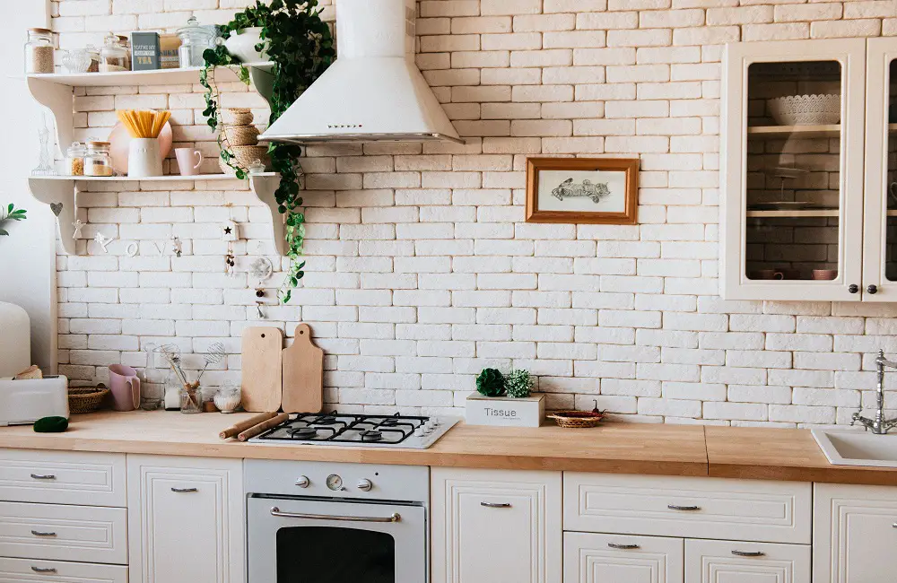
Off White
Neutral colors are timeless staples in interior design, and this applies to kitchen walls too. If you find yourself getting a headache from too much color while enjoying your morning coffee, there’s no need to worry. There are plenty of beautiful neutral shades inspired by nature that can give your kitchen an updated look.
While white is still a popular choice for kitchens, many designers are now exploring warmer hues. Cream, beige, and ivory are excellent options that offer the same light and neutral feel, without the starkness of pure white.
Cream, with its pale butter-yellow undertone, works particularly well in traditional, heritage, and country-style kitchens. You can fully embrace this buttery shade by applying it to both the walls and cabinetry. Cream walls also create a perfect contrast for darker cabinetry. Consider pairing blue, teal, or gray woodwork against the creamy walls for a striking effect.
Beige, on the other hand, adds a subtle touch of brown to your light neutral walls. This shade anchors minimalist and Scandi interiors, providing a backdrop for warm color palettes, including yellow, orange, and terracotta.
Instead of sticking to sterile white, here are a few warm neutral suggestions that you can try:
- Harvest Moon by Backdrop
- Like Buttah by Clare
- Limitless by Glidden (Color of the year 2024)
- Vallinin by Sherwin-Williams
These additional words and information should help to improve the overall structure and provide more details about using warm neutrals in kitchen design.
Final Thoughts
To revitalize your kitchen, consider incorporating colors inspired by the beauty of the natural world. For a cool and bright ambiance, shades of blue and green are ideal. To add a touch of warmth, opt for terracotta, yellow, and cream tones. For a more dramatic effect, intense inky blues, greens, and browns can be utilized. By carefully selecting and combining these colors, you can create a visually stunning and inviting space that reflects your personal taste and style.
